Sunday, October 23, 2011

"Andy Warhol"


Within what art genre did Warhol work? He worked in filmography and documentary.

Define the genre? Even though he was an artist in created anything from a canvas to a rug, he enjoyed film and starred in many of his own and also in others.

During what years was he alive? Andy Warhol was born in 1928 and lived until February 22, 1987 due to an illness. He was in a time that celebrities, bands, and fame became more "plastic", and he liked it.

Post 2 samples of his art. Answer the following questions for each piece.

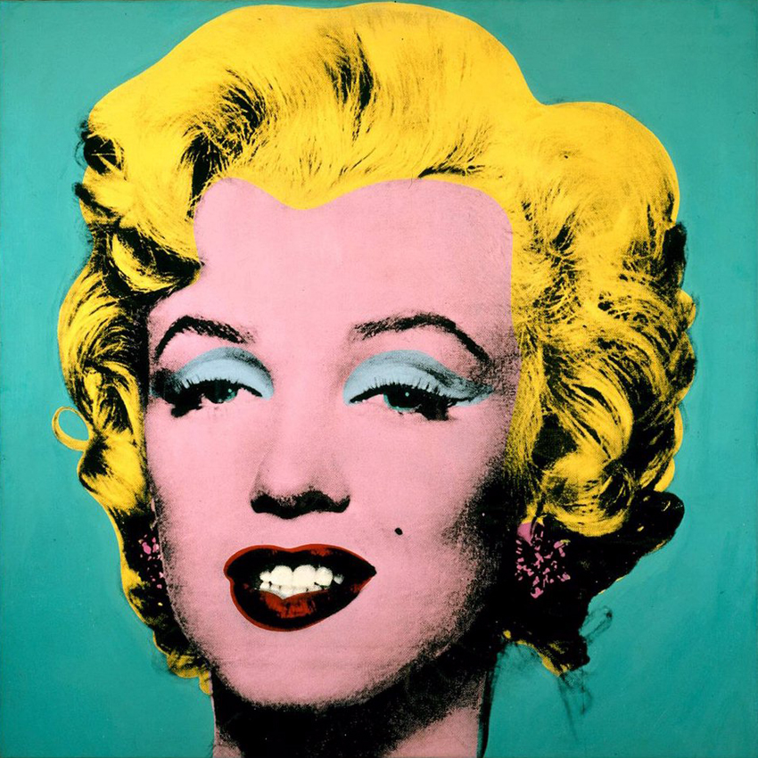
Title of the piece? The first one is one of the many other Marilyn Monroe Prints. The second piece is the first design of Campbell's soup.
Describe the color that he utilizes. Does he use any particular color scheme? In the Marilyn Monroe Print, Warhol used non-representational colors of pop culture meaning that the colors used are not the original colors in real life. In the Campbell's piece, there are two main distinct colors which are white and red.

What do you notice about the artwork itself? He created pieces that were way ahead in its time period and it was nothing like the art being created back then.

"Color Schemes"


01.jpg

                                                               
                                                                    Complementary


02.jpg


                                                                Warm colors


03.jpg


                                                                Monochromatic

04.jpg

                                                                Complementary


05.gif


                                                                          Tetrad

Friday, October 14, 2011

"Revew Week 9"

Compare and contrast vector graphics and pixel images. Vector graphics are defined by mathematical equations and are scalable, and pixel graphics, also called raster-based graphics, are images constructed of pixels.

What resolution is necessary to print raster images?
Resolution used for pixel count in digital imaging.

What resolution is necessary to display raster images on the internet?
Typically a maximum of 72 dpi (dot per inch).

Tuesday, October 11, 2011

"Steve Jobs"

Who is Steve Jobs? He is the co-founder of the Macintosh company and Apple Inc.

What company was he CEO for many years? He was CEO of Apple Inc.

What did he do for the computer industry? He was an inventor an created many electrical devices from computers to phones and more.

How did this man impact the graphic design industry? He helped make their lives much easier with technology as well as many others around the world.

"Review Week 8"

Why must designers pay close attention to how color is utilized within a composition? Color is what brings attention and focus to a design, which is what makes the viewer think and respond to the message being conveyed.

Why is the color wheel an important tool for graphic designers? The color wheel shows relationships of colors, and designers can utilize it to enhance a design.

Find an example of neutral colors utilized within a design (hint: google poster design). Near the sample, discuss why you feel the designer included neutral colors within the composition. 
 
 The designer included neutral colors by mixing complementary colors opposite the color wheel.
 
 http://thumbs.dreamstime.com/thumblarge_240/1203875665xNFJo2.jpg

Briefly describe how we "see" the color of an object? Every object is not the color it seems but a range of colors. It is really just reflecting the color itself.

Friday, October 7, 2011

"Podcast #2 Color Theory"


The right use of color can do what?  It can maximize productivity, minimize visual fatigue, and relax the whole body.

Within the electromagnetic spectrum, which waves allow us to see color? Visible light waves.

Describe white light? Equal parts f all colors in visible spectrum.

How do we see color if objects "have no color of their own"? They color of the actual object is reflected, so they appear to be in color when they absorb or reflect colors in the visible spectrum.

What is a glass prism? Transparent , triangular object that breaks white light into all the colors or the visible light spectrum.

What seven colors result when white light is refracted through a prism? Red, orange, yellow, green, blue, violet, and indigo.

Describe hue? The color itself, different reflectment of the wave of light.

When does white light occur? When all wavelengths are reflected to the back of your eye.

When does black light occur? When no light is reflected to your eye.

How color is perceived depends on what? The type of light it is seen with.

What is a color wheel? Visual tool that shows the relationship between primary, secondary, and tertiary colors.

What are primary colors? Name them? Red, yellow, and blue.

What are secondary colors? Name them? They are a mixture of primary colors, which is orange, purple, and green.

What are tertiary colors? Name them? A mixture of primary and secondary colors, which are yellow-orange, yellow-green, red-orange, blue-green, red-violent, and blue- violet.

What are neutral colors? How can they be created? Colors with very low saturation. They can be created by mixing a complementary color pair.

How can a neutral color help a design? It can help to put the focus on other colors or to tone down colors.

What are complementary colors? Name them? Colors positioned opposite each other on the color wheel. Yellow and violet, red and green, and orange and blue.

What is color value? It refers to the lightness or darkness of the hue.

What is a shade? Low-value color by adding black to a hue.

What is a tint? High-value color by adding white to a hue.


What is saturation/intensity? The brightness of a color.

What happens when you mix complementary colors together? You produce a dull tone or increase there intensity.

Describe color harmony? Pleasing arrangements of parts like music, poetry color, etc.

What is a color scheme? Harmonious color combinations used to create style and appeal.

Describe a monochromatic color scheme? Uses tints or shades (value) of one color.

Describe an analogous color scheme? Uses three colors next to each other on the color wheel. One is used as a dominate and the other two are used to enhance it.

Describe a complementary color scheme? Two colors opposite each other on the color wheel.

Describe a split-complementary color scheme? Variation on the complementary color scheme (one color and two next to its compliment). It will draw attention but without the tension on the compliment scheme.

Describe a triadic color scheme? It uses three colors equally spaced around the color wheel. It offers strong visual balance.

What colors are considered to be warm colors? Red, orange, and yellow.

Describe a warm color scheme? Bold and energetic, brings attention.

What colors are considered to be cool colors? Green, blue, and violet.

Describe a cool color scheme? Gives an impression a calmness and it gives and illusion depth and appearance of being far away.

Why is important to consider which colors are being used within a design? The right color choice can help convey the message and it evocts a desired response.
Monday, October 3, 2011

"Review Week 6"


What is the pen tool used for?
The pen tool is used to define a path using anchors to control corners and curves which eventually turn into an object.
How can you manipulate a path/line in Illustrator? Discuss the use of the white arrow tool, pen+, pen-, and convert too.You can manipulate a path by adding or loosing anchors. The white arrow tool is used to do this task. Pen+ is used to add anchors to change the path and pen- is vise versa.
How can you utilize the layers palette in Illustrator?
The layers palette is used to place a picture in Illustrator and lock it in place (a layer) and create a new layer and do whatever to want with it like use the pen tool or trace the picture with shapes.
How do you create a clipping mask in Adobe Illustrator?
First, you create a square around your design in the desired space you want to mask. Next, you arrange the square to the front and highlight the design. Lastly, you create a mask.

"Review Week 5"

                                                 
Shape: There are two types of shapes: geometric and organic. These shapes are geometric meaning they are not man-made like organic shapes. Shapes can be used for various reasons. This can include adding space, boundaries and material in a design.


Lines: There are many type of lines. You have vertical, straight, curved, horizontal, and more. These lines are horizontal. They create a feeling of rest, safety, and comfort. In this design the lines are horizontal and somewhat curved.


 Texture: This is the surface quality of a work of art. It lets you get a physical and mental feeling of a design. In this design you can visualize that it is rough, and wrinkled without actually feeling it.


             Space: This is the area around a design or object. It can be either negative or positive. This design incorporates negative space. There are lines that define a specific area and the space around it is black or negative.


https://blogger.googleusercontent.com/img/b/R29vZ2xl/AVvXsEhOWsdUzOze-_-7eHx_MNo_bUQZn8meC5JrQAm39kJ7T_a17X4RsVLaJIrpRcQBRDouecys0rV5UMnCTd7RziPjvTwx6FV_n0qMa__1pPUny_nK9W0vFa9u1FpE1ZGNm2doApGfxipNDOiy/s1600/moonrise-hernandez-ansel-adams.jpg                                           
Value: This is the degree of light tones and dark tones and everything in between in a design. So basically it is white and black and greys. In this design, the ground is the darker part and it tends to get lighter more in the sky and then darker again once at the atmosphere.